find the "Observed" O as the number of observations in each bin.
find the "Expected" E as the probability the bin of a normal distribution (using the sample mean and variance)
find
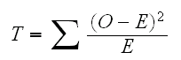
then T has a chisquare distribution with k-3 degrees of freedom
Example let's have a look at the data in Euro Coins. How can we visualize this dataste? Usually we start with a histogram:
hist(euros,breaks=100)
which shows a unimodal distribution with a few outliers. Another graph for this data is the boxplot, drawn by
boxplot(euros)
It is based on the 5-number summery (Min,Q1,Median,Q3,Max) plus some rules on the upper and lower fences, often LF=Q1-1.5IQR and UF=Q3-1.5IQR where IQR=Q3-Q1 is the interquartile range.
Here is something interesting: first
plot(names(euros),euros)
which draws a standard scatterplot, but
plot(as.factor(names(euros)),euros)
draws the boxplot. This is an example of object-oriented programming: when plot is called it examines its arguments. When it is applied to two vectors of numbers it draws the scatterplot, but when it is applied to a factor (a specical data type) and a vector of numbers it draws the boxplot. There are many other versions of plot applied to different arguments, as we shall see.
Many statistical methods depend on the assumption that the data come from a normal distribution. In the euros case both the histogram and and the boxplot make this assumption suspect. There is another graph quite useful here: the normal probability plot, drawn by
qqnorm(euros)
The idea is that the dots in the graph should follow a straight line if the data comes from a normal distribution.
qqline(euros)
adds a line though the quantiles.
What is drawn here? essentially it is the quantiles of the standardized data vs. the quantiles of the standard normal distribution:
for some -3<z<3 find (#(Obs-mean(Obs)/sd(Obs)<z)/n and P(Z<z)
(There are some refinements for small datasets that are not important for us)
We could have done the graph ourselves with
plot(qnorm((1:2000)/2001,100),sort(euros))
Example the routine graphs.sim generates n observations from a distribution and plot the histogram, the boxplot and the normal probability plot. Try
graphs.sim("norm")
graphs.sim("norm",mean=100,sd=15)
graphs.sim("t",df=1)
graphs.sim("t",df=10)
graphs.sim("beta",shape1=1, shape2=1)
graphs.sim("beta",shape1=10, shape2=10)
graphs.sim("gamma",shape=1, rate=1)
graphs.sim("gamma",shape=10, rate=1)
graphs.sim("gamma",shape=100, rate=1)
So the euros data clearly does not come from a normal distribution. The problem seems to be a number of outliers on both sides, or a "heavy-tail" distribution, say a t distribution. Let's check:
plot(qt((1:2000)/2001,1),sort(euros))
plot(qt((1:2000)/2001,1),sort(euros))
plot(qt((1:2000)/2001,1),sort(euros))
none of these work, so the true distribution might be something else. Notice, though that the qqplot does not work so well for the t-distribution because the sample quantiles have a large variance:
plot(qt((1:2000)/2001,1),sort(rt(2000,1)))
There are also a number of formal hypothesis test. The most famous is a general purpose "goodness-of-fit" test based on Pearson's chisquare statistic It works like this:
divide the range of the data into k bins
find the "Observed" O as the number of observations in each bin.
find the "Expected" E as the probability the bin of a normal distribution (using the sample mean and variance)
find
then T has a chisquare distribution with k-3 degrees of freedom
Example For the euros data
normal.test(1,data=euros)
carries out the test.
There are a number of problems with this test: what should k be? Should we use equal-size bins or adaptive binning, that is bins that are chosen so that that each contains(roughly) the same number of observations, see
normal.test(2,data=euros)
How about the t distribution?
normal.test(2,data=euros,dist="t",df=3)
tests for a t distribution with 3 degree of freedom, which again fails. The same for the others.
Another famous test if the Kolmogorov-Smirnov test. It compares the quantiles of the data with the respective quantiles of the distribution. It is implemented in the R routine ks.test. One drawback is that we cannot estimate the parameters from the data. Instead we can estimate the null distribution using simulation, see
normal.test(3,data=euros)
Example In the case of the euro coins we also have info on the rolls. How can we visualize the data including this information? First the histogram does not generalize very well, so we won't consider it. For the boxplot we have
boxplot(euros~names(euros)).
The corrsponding probability plot is done in
euros.qq()
There is very nice package called "trellis graphics". It is available after typing
library(lattice)
and its version of the boxplot is done by
bwplot(euros~names(euros))
The corresponding normal probability plot is done with
qqmath(~euros|names(euros)).
How can we add the straight lines to the plot? This gets a bit complicated and is done in
euros.qq(2).
Trellis graphics use code that is quite different from "standard" R. How can we use it for our purposes? To get started find the command you want to use, here qqmath, and look at the help file
?qqmath
at the bottom there are usually some examples. The second one is for a data set called Singer. Just run it to see what happens. Simply copy-paste the example into some function, say tst
fix(tst)
this does the graph we want, a normal probability plot with the lines. Now just change the data set in tst, here change height to euros, voice part to names(euros) and eliminate the data=singer part.
Example Consider the data in Singer. Clearly here the interesting question is how the pitch changes with voice part. Let's check the boxplot:
attach(singer)
boxplot(height~voice.part, horizontal =T)
One thing about this graph that is not "nice" is the y-axis labels. Some are suppressed, and they are printed parallel to the axis which makes them hard to read. Try
boxplot(height~voice.part, horizontal =T,las=1)
las is one of a long list of arguments one can give to almost all plotting routines. For a detailed description see
?par
Better, but part of the longer labels are still not right. Try
par(oma=c(0,2,0,0))
boxplot(height~voice.part, horizontal =T,las=1)
Both the euros and the singer data consist of two variables, one with a contiuous measurement, the other a discrete factor. There is one difference, though, in the case of the euros the factors are unordered whereas the voices are ordered by their pitch. This ordering should also be used in the graphs. In the euros case we could have first ordered the rolls in some way, for example by the mean of the weights:
weight.means=tapply(euros,names(euros),mean)
I=c(1:8)[order(weight.means)]
tmp=euros
for(i in 1:8) tmp[names(tmp)==i]=euros[names(euros)==I[i]]
boxplot(tmp~names(tmp))
Back to the singers. It seems that the height of the singer goes up as the pitch of the voice goes down, just as one expects. Can we draw a graph that focuses more on this change? How about
dotplot(voice.part~height)
Or even better
means=tapply(height,voice.part,mean)
dotplot(means)
This not only shows the change very well, it also shows a "jump" when we go from the female to the male voices.
Let's do some Statistics: first we need a probability model for the data. say Xij is the ith height of the jth voice part. So X11=64, X82=75. We might begin with a model of the form
Xij =μi+Zij
where Zij~Fi and E[Zij]=0
essentially saying the heights of the singers in each voice part have some distribution (possibly different) with a mean of μi. Note that the only restriction we have put on the model so far is that observations in the same group have the same distribution.
Now let X̄i be the sample mean height of the ith voice part, so for example X̄7=70.72. Now X̄i is our best guess ("estimate") for the height of somebody with voice part i, that is of μi. These are called the fitted values.
eij=Xij - X̄i
are the deviations from this estimate of the actual observation, these are called residuals. So we have
Xij = X̄i +eij
What do these residuals look like? We have
residuals=height-rep(means,table(voice.part))[235:1]
the [235:1] is needed to match up the corresponding observations. Now
boxplot(residuals~voice.part,horizontal=T,las=1);abline(v=0,lwd=2)
What can we say about the residuals? By their definition we have E[Zij]=0. How about their distribution?
singer.qq()
shows that the residuals have a normal distribution.
singer.qq(2)
shows the corresponding trellis graph, which is quite a bit nicer!
So now we have a model of the form
Xij=μi+Zij
where
Zij~N(0,σi)
Another improvement comes from the observation that the standard deviations of the residuals in the groups seem to be about the same
dotplot(tapply(height,voice.part,sd))
so we can further refine our model to
Xij=μi+Zij
where
Zij~N(0,σ)
Because the groups have the same standard deviation we can pool the residuals to estimate their standard deviation
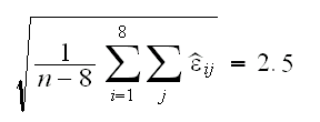
With this we can find 90% confidence intervals for the true height of the singers by
X̄i±z0.05s = X̄i±1.96*2.5 = X̄i±4.9
For example for Soprano 2 we find 64±4.9 or (59.1,68.9)
How useful is "voice.part" as an explanatory variable for "height"? We can study this by comparing the spread of the fitted values with the spread of the residuals. The larger the spread of the fitted values is relative to the spread of the residuals the more useful a variable "voice.part" is. A nice graph to check this is the residual-fit spread plot (r-f spread plot) drawn by
rfs(lm(height~voice.part))
It shows that while voice.part explains some of the variation in height, there is still quite a bit remaining
Note that rfs needs as its argument an object of type "lm". This is the "linear model" routine which we will use a great deal. We could have used it already to do some of the calculations above.
fit=lm(height~voice.part)
summary(fit)
fitted.values(fit)
residuals(fit)
Notice the line Residual standard error: 2.503 on 227 degrees of freedom, that's our estimate of σ.
Example: rfs.sim(sd=5) generates data (x,y) with y=x+N(0,sd), draws the scatterplot with the least squares regression line and (after hitting any key) the rf-spread plot. Try sd=5, 1, 0.1
Example how about the euros? Here the obvious question is whether there are any differences between the rolls, that is we want to test
H0: μ1=..=μ8 vs Ha: μi≠μj for some i≠j
If the data were normal, we could use a one-way ANOVA to answer this question, but it is not. Next one usually tries some transformations, but those won't work here either. So what can we do? First we need a test statistic, for example M=max{|X̄i-X̄j|;i,j=1,..,8}. Clearly a large value of M would indicate that the null hypothesis is false. We find
means=tapply(euros,names(euros),mean)
max(means)-min(means)
M=0.022. But how arge is large, that is, what is the null distribution of M, that is its distribution if the null hypothesis is true? Now under the null hypothesis all the weights come from the same distribution, so reordering them in any way will not change their joint distribution (exchangeability). So we can do the following:
Reorder the data randomly, calculate M1 for this data, repeat many times
If the null hypothesis is true, the Mi's found in this way should be "similar" to the M from the data. If not M should be be greater. So
p-value=%{Mi>M}
This is done in
euros.test()
which gives some indication that indeed there are differences between the rolls.
Does this test really work? Check
x=rnorm(2000)
names(x)=names(euros)
euros.test(x)
or
x=rt(2000,2)
names(x)=names(euros)
euros.test(x)
This type of test is called a permutation test.
Of course we could also have done a non-parametric test. The usual one for this problem is the Kruskal-Wallis test for the equality of the medians:
kruskal.test(euros,g=as.factor(names(euros)))
which also rejects the null hypothesis.
Example Consider the data in Cat's eyes. Here we have two continuous variables, so the standard graph is the scatterplot, for example
attach(cateyes)
fit=lm(cp.ratio~Area)
plot(cateyes)
abline(fit,lwd=2)
The corrsponding Trellis graph is done by
xyplot(cp.ratio~Area)
Of course we could have started by looking at each variable individually, say with a boxplot
boxplot(Area)
boxplot(cp.ratio)
or even better, combine the scatterplot and the boxplots:
addbox(cp.ratio,Area)
This uses the layout command, which is useful to do complicated graphs with different "windows"
Back to the analysis. The fitted line plot shows that the relationship between Area and cp.ratio is not linear, which is even clearer in
plot(fitted.values(fit),residuals(fit));abline(h=0,lwd=2)
Say we want a 90% CI for the cp.ratio if the Area is 45cm2. We can do this by fitting a non-parametric regression model to the data. One nice method is called loess. We will discuss the mathematical details later, here is just how we use it:
fit=loess(cp.ratio~Area)
predict(fit,newdata=45,se=T)
yields a fit of 4.15 with a standard error of 0.41
This standard error, it is the error of what, of the mean response or of an individual response? (is it "s" or "s/√n"?) The confidence interval we want, is it 4.15±1.645*0.41 or 4.15±1.645*0.41/√14? Let's see:
?loess
and then clicking on predict.loess says
se: an estimated standard error for each predicted value
so it seems it is the error of an individual reponse. If we are not sure, can we check? In
cateyes.boot()
we use the bootstrap to get an estimate of the standard error of a new observation and it matches se quite well, so a 90% CI for the cp.ratio the eye of a cat with an eye with area 45cm2 is 4.15±1.645*0.41 or (3.3, 5.0)
What does this loess fit look like?
plot(cateyes)
x=seq(10,140,length=100)
lines(x,predict(fit,newdata=x))
adds the fit to the scatterplot. loess does have its own parameter, controlled by span, for example
plot(cateyes);lines(x,predict(loess(cp.ratio~Area,span=0.5),newdata=x))
loess has a number of uses, for example adding it to a residual vs. fits plot
fit=lm(cp.ratio~Area)
plot(fitted.values(fit),residuals(fit))
fit1=loess(residuals(fit)~fitted.values(fit))
x=seq(min(fitted.values(fit)),max(fitted.values(fit)),length=100)
abline(h=0)
lines(x,predict(fit1,newdata=x))
shows clearly that there is some structure in the residuals. This graph is so useful i wrote a little routine to make it, resfit.plot().
Example Consider the data in Fly's eyes. Here we have one continuous variable - facets and one which is measured discretly but is conceptually continuous - Temperature. We can therefor consider the box plot
attach(fly)
boxplot(Facets~Temperature)
or the scatterplot
plot(fly,xlab="Temperature",ylab="Facets")
One problem with the sctterplot is that many observations are printed on top of each other. This we can fix by jittering, that is add a little bit of "noise" to each observation
plot(jitter(fly[[1]]),jitter(fly[[2]]),xlab="Temperature",ylab="Facets")
Here is another way to visualize that data: plot the temperatures vs. their mean response:
means=tapply(Facets,Temperature,mean)
plot(unique(Temperature),means,xlab="Temperature",ylab="Means of Facets")
this brings out the relationship between the variables very nicely, but we do loose the info on the spread within the groups. Here is a way to retain that as well:
s=tapply(Facets,Temperature,sd)
low=means-s
high=means+s
plot(unique(Temperature),means,xlab="Temperature",ylab="Means of Facets",ylim=c(min(low),max(high)))
segments(unique(Temperature),low,unique(Temperature),high)
One needs to be careful: these are pointwise CI's, not a confidence band for the curve. Moreover note that we use s, not s/√n, so this is a confidence interval for a new observation, not for the population mean. Finally we use one standard deviation, not say 1.645s, a convention in graphs.
what is the data in means? They are estimates of E[Facets|Temperature=k]. We will come back to this idea soon.
Example Consider the data in Ozone Levels. We might begin as follows:
attach(ozone)
fit=lm(stamford~yonkers)
plot(ozone)
abline(fit,lwd=2)
resfit.plot(fit)
and we see that a linear model fits the data quite well. There is one problem with the fitted line plot: it makes it appear the the slope of the increase is one. Maybe it would be better to draw the graph like this:
plot(ozone,xlim=range(ozone),ylim=range(ozone))
abline(fit,lwd=2,col="blue")
abline(0,1)
which shows that the concentrations increase more inStamford thanin Yonkers.
As another graph useful for this type of data we can draw Tukey's Mean-Difference plot. This graphs the means for each pair of observations vs. their difference:
plot(apply(ozone,1,mean),apply(ozone,1,diff),xlab="Means",ylab="Differences")
even easier is using the trellis function tmd
tmd(stamford ~ yonkers)
The usefulness of Tukey's m-d plot lies in the fact that it concentrates on the differences between the two variables. It is clear that concentrations at Stamford are higher than at Yonkers, in all but 10 days the concentration at Stamford exceeds that at Yonkers. The pollution is of course caused by New York City, and so it is at first surprising that it should be higher at Stamford, which is 20 miles farther from New York City than Yonkers. The reason is that Stamford lies downwind from New York City on most days.
But let's go back a step. Can we do something similar to the plot of the conditional means as in the last dataset? Clearly the problem is that the x values here are unique, but how about the following:
Index=c(1:length(stamford))[yonkers>40&yonkers<50]
mean(stamford[Index])
and so on, see
ozone.means(1)
One useful idea is to realize that the intervals need not, maybe should not, be disjoint, see
ozone.means(2)
Another idea is not to use equal-width intervals but intervals that contain equally many observations, so that each mean is based on the same number of data points, see , see
ozone.means(3)
And then of course all of this together! But there is a command already built into trellis that does most of the work : equal.count
plot(equal.count(yonkers,10))
shows the intervals.
ozone.means(4)
uses them to draw the graph. An finally
ozone.means(5)
does it all.
In the above we have calculated the mean of the stamford values conditional on the yonkers values. Sometimes it is useful just to look at the data itself, in which case we can use the trellis command coplot:
coplot(stamford~yonkers|equal.count(yonkers),panel=panel.smooth)
which also adds a loess fit. A little bit of care is needed to properly read this graph. The panel that corresponds to the smallest range of yonkers is the one on the lower left, then comes the one on its right etc.
In all the datasets sofar it made sense to use the predictor-response paradigm, that is to think of one variable as the response which we want to model using the predictor variables. In other words we used the variables asymmetrically. In this section we will have a quick look at data where the two variables should be treated equally.
Example consider the Weather in New York. specifically the data on wind speed and temperature. The goal here is not to determine how the variation in one explains the variation in the other, but to see how wind speed and temperature vary together.
As a first try we can certainly look at the scatterplot, where we arbitrarily put wind speed on the y axis:
env.fun(1)
The boxplots are drawn by
env.fun(2)
which give some indication that both variables have a normal distribution. This can be checked by a look at the normal quantile plots:
env.fun(3)
The temperature appears to be slightly "platykurtic", that is the normal plot has an S-shape indicating a distribution with short tails such as a uniform. The wind speed appears to be skewed a little towards large values, see also the couple of dots higher up in the scatterplot.
Next we return to the scatterplot and add a local regression fit (loess). Now though it makes not any more sense to look at loess(wind~temperature) rather than loess(temperature~wind), and so we just do both!
env.fun(4)
How about a linear model?
env.fun(5)
draws the scatterplot with the linear fits of wind by temperature and temperature by wind.
note: if x=ay+b, then y=(1/a)x+(-b/a)
The fact that regression of y on x produces a line different from regression of x on y is sometimes a problem. We can get a line that treats x and y symmetrically by averaging, see
env.fun(6)
but it is not clear what properties this line has. Such solutions in Statistics are called ad-hoc. They are not necessarily bad but we generally like to have some
"optimality" in our methods. Let's try and develop an optimal solution for this problem of "symmetric least squares regression". For that we need an optimality criterion, for example
the calculations are done by
slm(temperature,wind)
and added to the graph by
env.fun(7)
Example Let's consider the Ethanol dataset.
attach(ethanol)
How can we visualize the three variables NOx, C and E together? One way is an extension of the scatterplot called a scatterplot matrix. Here we draw the 6 pairwise scatterplots and arrange them in a "matrix".
pairs(ethanol)
The trellis version of this graph is
splom(ethanol)
We can add a loess curve to the pairs command by adding panel=panel.smooth:
pairs(ethanol,labels=c("NOx","Compression\nRatio","Equivalence\nRatio"),panel=panel.smooth)
Notice that the compression ratio C only takes 5 distinct values (7.5, 9.0, 12.0, 15.0 and 18.0) corresponding to the test engines available for this experiment. Another way to look at this dataset is as follows:
• Split the dataset into 5 parts, according to the 5 values of C
• graph NOx vs E accordingly, and add a loess fit.
a=unique(C)
x=seq(min(E),max(E),length=100)
par(mfrow=c(2,3))
for(i in 1:5) {
plot(E[C==a[i]],NOx[C==a[i]],xlab="E",ylab="NOx",main=paste("C=",a[i]))
y=predict(loess(NOx[C==a[i]]~E[C==a[i]]),newdata=x)
lines(x,y)
}
This is of course the same idea we used before in the Ozone data, namely conditioning on a range of data. Here, though, it becomes even more useful because we can condition two variables on a third!
coplot(NOx~E|C,panel=panel.smooth)
Clearly by default coplot groups the data much more than we did above. This is controlled by the argument "overlap", with default 0.5 meaning each panel containes 50% of the data.
coplot(NOx~E|C,panel=panel.smooth,overlap=0)
We can "recover" the coplot from the beginning using the given.values argument
coplot(NOx~E|C,panel=panel.smooth,given.values=sort(unique(ethanol$C)))
Of course we can switch the role of C and E, that is we can condition on E and use C in the panels. Here we use 9 panels (number=9), arrange them into two rows (row=2), and add the loess fit with span=2.
coplot(NOx~C|E,panel=panel.smooth,span=1,overlap=0.25, number=9,row=2)
In this graph we find something interesting: while in all panels the relationship appears to be linear, for low values of E the slope of the line is positive whereas it becomes 0 as E gets larger.
Example consider the data for the galaxy NGC 7531. First
attach(galaxy)
plot(east.west,north.south)
shows us the locations of the measurements. Each point represents several measurements, so maybe it would be better to use
plot(jitter(east.west,amount=1/2),jitter(north.south,amount=1/2))
on the other hand now it is not clear that the measurements were done along straight lines.
The goal of the analysis is to understand how the velocity changes over the measurement region, so velocity is the response and the coordinates are the predictors. Conditioning on the coordinates is not going to be very helpful here because both coordinates are equally important. On the other hand conditioning on the response might help:
levelplot(velocity~jitter(east.west)*jitter(north.south)|equal.count(velocity,9))
shows that the region with lowest velocity is in the North-East, and the velcity increases as we move to the South-West
As we said, the measurements were taken along straight lines. The variables "angle" and "radial.position" are therefore a different (but equally valid) coordinate system which we can also use:
coplot(velocity~radial.position|angle,given.values=sort(unique(angle)),panel=panel.smooth)
which shows that the velocity along the lines varies quite non-linearly.
Another way tograph this data is via a contour plot, that is graphing lines of equal velocity. This is done with the contourplot command. In
galaxy.fun()
we plot the lines based on the loess estimates.Or of course we can use the levelplot command again
galaxy.fun(2)
Finally we have the option of a pseudo-three-dimensional wireframe diagram
galaxy.fun(3)
we can change the default "viewpoint" by giving the argument "screen", but it can be quite difficult to find an interesting one"
galaxy.fun(4,c(50,-50,50))
One alternative to wireframe is a three-dimensional scatterplot, see
galaxy.fun(4)
Example consider the data in US Temperature. Let's say we first want to visualize the locations of the cities. We can start with a scatterplot
attach(ustemp)
plot(Longitude,Latitude)
but of course (?) we really need to use
plot(-Longitude,Latitude)
The use of -Longitude is necessary to get the graph to look right but is not very nice as labels on the graph. Here is a way to get that right as well:
plot(-Longitude,Latitude,pch=15,xlab="Longitude",axes=F)
axis(1,at=-c(120,110,100,90,80,70),labels=paste(c(120,110,100,90,80,70),"W",sep=""))
axis(2,at=c(25,30,35,40,45),labels=paste(c(25,30,35,40,45),"N",sep=""))
But here the data is geographic locations, and for those we have a nice standard graph, called a map. Can we plot the data inside a map? To do so we need another dataset with the Longitudes and Latitudes of the US, which we have in usa. So
plot(usa,type="l",xlab="Longitude",ylab="Latitude",axes=F)
axis(1,at=-c(120,110,100,90,80,70),labels=paste(c(120,110,100,90,80,70),"W",sep=""))
axis(2,at=c(25,30,35,40,45),labels=paste(c(25,30,35,40,45),"N",sep=""))
points(-Longitude,Latitude,pch=15)
What are the cities?
text(-Longitude,Latitude,City,cex=0.75)
adds their names, but makes some of them unreadable. If we want only a few we can use
identify(-Longitude,Latitude,City)
and clicking on the symbols. A right-click gets us back to R