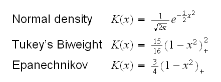
where K is a Kernel function, for example
and h is the tuning parameter, with a small h leading to a ragged estimate with a high variance.
In ethanol.fun(3) we draw the loess curve for the ethanol dataset for different values of span, say 0.2, 0.4 and 0.6.
Notice that for small values of span we get a very rugged curve that follows the observations closely, so we have a curve with a high fit but also high variance. For large values of span we get a curve that is very smooth, that is it has a small variance but it also has a low fit. Choosing a good value for the "tuning parameter" always involves a bias-variance trade-off.R has a number of different methods for smoothing implemented. Some of them are
• loess, see above
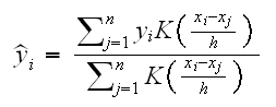
• ksmooth finds the Nadaraya-Watson kernel regression estimate which is of the form
where K is a Kernel function, for example
and h is the tuning parameter, with a small h leading to a ragged estimate with a high variance.
• smooth.spline fits a cubic smoothing spline.
Splines are smooth piecewise polynomial functions often used in numerical analysis. Cubic splines specifically use polynomials up to degree 3. The cubic functions change at points called knots and are chosen such that the whole function is continuous.
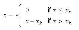
As an artificial example consider spline.fun(). Here we generate some data, using the model y=5-2x+0.35*x2-0.01x3 if x<5 and y=2.5 if x>5 and say we wish to fit cubic splines to the dataset. That is we fit a model of the form
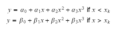
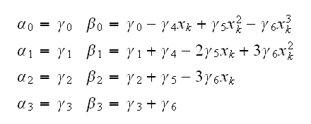
where xk is a knot. Sometimes knots are also estimated from the data, but let's keep it simple and assume we know that xk=5.0. Then we need to find the least squares estimates of α0, ..., β3 subject to the condition that α0+α15+α252+α353 = β0+β15+β252+β353
In order to fit such a model it is useful to introduce a new variable z with
Now we can use polynomial regression to fit the model

and recover the coefficients in the spline funtion:
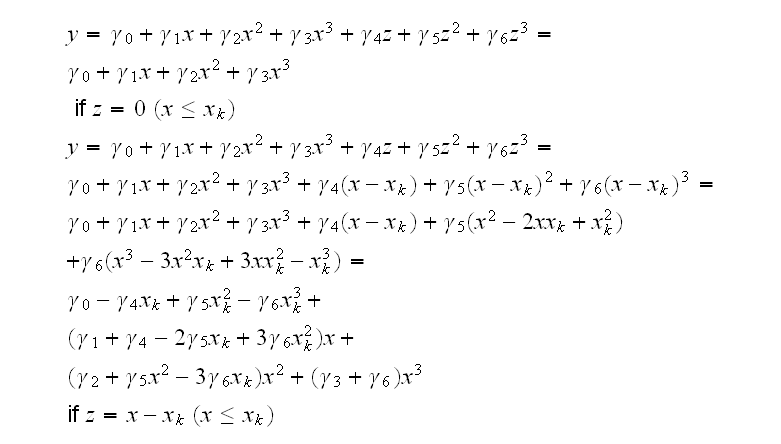
and so
This is implemented in spline.fun()
The easiest way to fit splines is via the function smooth.spline, as is done in spline.fun() as well. Notice though that this does not allow us to fit the exact model we had in mind, with the knot at 5.
ethanol.fun(4)
draws some some curves using these methods. Generally the choice of method is not as important as the choice of the tuning parameter, and we will use loess in this class.
How do we do interval estimation when using loess? As with the predict method for lm we can again get an estimate of the standard error by including se=T. How does this error differ from the one found by lm? Let's find out. For this we do a little simulation study in
loess.sim(1)
We generate 100 x uniform on [0,10] and then 100 y=10+3x+N(0,3). We fit the loess model (using span=0.75) and predict yhat at x=5.0. We see that the errors in loess are larger (with a larger standard deviation) than those of lm. This to be expected, after all we are using a lot more information in lm, namely the exact model for the data and the exact distribution of the residuals.
As we saw before the errors returned by predict are standard errors of the fit, useful for confidence intervals. In
loess.sim(2)
we use them to find prediction intervals, and clearly that does not work. So how can we find prediction intervals using loess?
Let's recall the equations for the two errors:
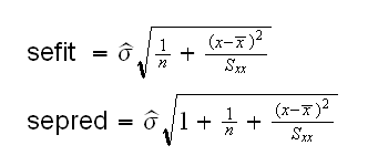
So we have
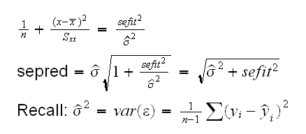
The residual standard error is already part of the fit object and available as as.numeric(fit[5]). In
loess.sim(3)
we find the prediction errors and use them to find prediction intervals. Clearly this now works well.
Let's return to the ethanol data, and say we want to find a 90% prediction interval for E=0.9. Using loess with span=0.7 we find the interval in
ethanol.fun(6)
to be (3.03, 4.27).
One possible problem with this solution is that the "1.645" only makes sense in the context of the normal distribution, which may or may not be true here. In
ethanol.fun(7)
we plot the residuals vs. fits plot and normal probability plot for this model, and the assumption of normally distributed residuals appears ok. So this prediction interval should be reaonably good.
What if we don't just want an idea of the variation at one point x, but for the curve as a whole? We can do the following: for equal space points x find the corresponding estimates of y with their standard errors, find the confidence intervals at each point and connect all the lower and all the upper limits. This is done in
ethanol.fun(8)
A bit of care, though, is needed in interpreting this curve: it consists of pointwise confidence intervals and is not a confidence band for the curve as such. If the "envelope" is computed at a large number of points, say 100, then Bonferroni's inequality suggests drawing the envelope with something like 0.999999.
Local regression curves are useful throughout the analysis process. To illustrate this, let's redo the analysis of the US Temperature data. In
ustemp1.fun(1)
we draw the scatterplots of JanTemp vs. the predictors and add several loess fits for different spans. We see that the relationship of Longitude and JanTemp is somewhat complicated, with one peak and one valley. The relationship of Latitude and JanTemp is mostly linear, with an upturn at the right side.
In the next step we could switch to parametric fitting, choosing a linear model in Latitude and a cubic model in Longitude as before. In order to check the fit we then of course look at the Residual vs. Fits plot, where we find another use for the local regression fit. These are often added to the diagnostic plots to make them easier to read. In
ustemp1.fun(2)
we draw the Residual vs. Fits plot (using studentized residuals) and add the loess smooth and a horizontal line at 0. Ideally the loess curve should follow the horizontal line. There appears to be still a bit of lack of fit.
In order to see which of the predictors is not yet fit properly we look at the Residual vs. Predictors plots. Again we add a loess fit and the horizontal line, in
ustemp1.fun(3)
Clearly the problem comes from Latitude.
How can we fix this problem? Of course we can again use the polynomial fitting, this time for Latitude. In
ustemp1.fun(4,deg=2)
we fit a polynomial of degree deg to Latitude and check the Residual vs. Fits plots. It appears that we need to go to at least deg=5 before we fix this problem.
This would leave as with a rather complicated solution: a 5th degree polynomial in Latitude and a 3rd degree one in Longitude. Moreover, there is no reason to think that polynomials are actually "right" for this problem, anyway. Now the most important advantage of parametric models over nonparametric ones is that they can be interpreted, but with such high degrees that is not really the case either. So maybe we should just forget about the parametric fitting and stick with non-parametrics. In
ustemp1.fun(5)
we check the Residual vs. Fits plots for the loess fits. It does not look all that great either, probably because of the non-equal variance in JanTemp.
Can we visualize this fit in the same way we did it for the parametric fit? For this we need to predict the temperature for many locations in the USA. We do this as follows:
• set up a grid of ngrid equally spaced Latitude values in La.grid
• set up a grid of ngrid equally spaced Longitude values in Lo.grid
• compute an ngrid by ngrid matrix where each cell corresponds to one pair of the values in (La.grid, Lo.grid). This is easiest done using the function expand.grid.
• use the predict method for a loess fit object.
The result is an ngrid by ngrid matrix z where the (i,j) entry of z is the predicted value of La.grid[i] and Lo.grid[j].
Now we continue as before: devide the temperature range into 6 equal length intervals and "assign" each value in z its corresponding interval number.
The result is drawn in
ustemp1.fun(6)
In
ustemp1.fun(7)
we put the graph for the parametric and the nonparametric fit next to each other. They seem reasonably close, with the variation in the parametric fit a little bit larger.